Human-Centered Design Guide Series
Using HCD Process to create HCD Guidance for Non-Designers
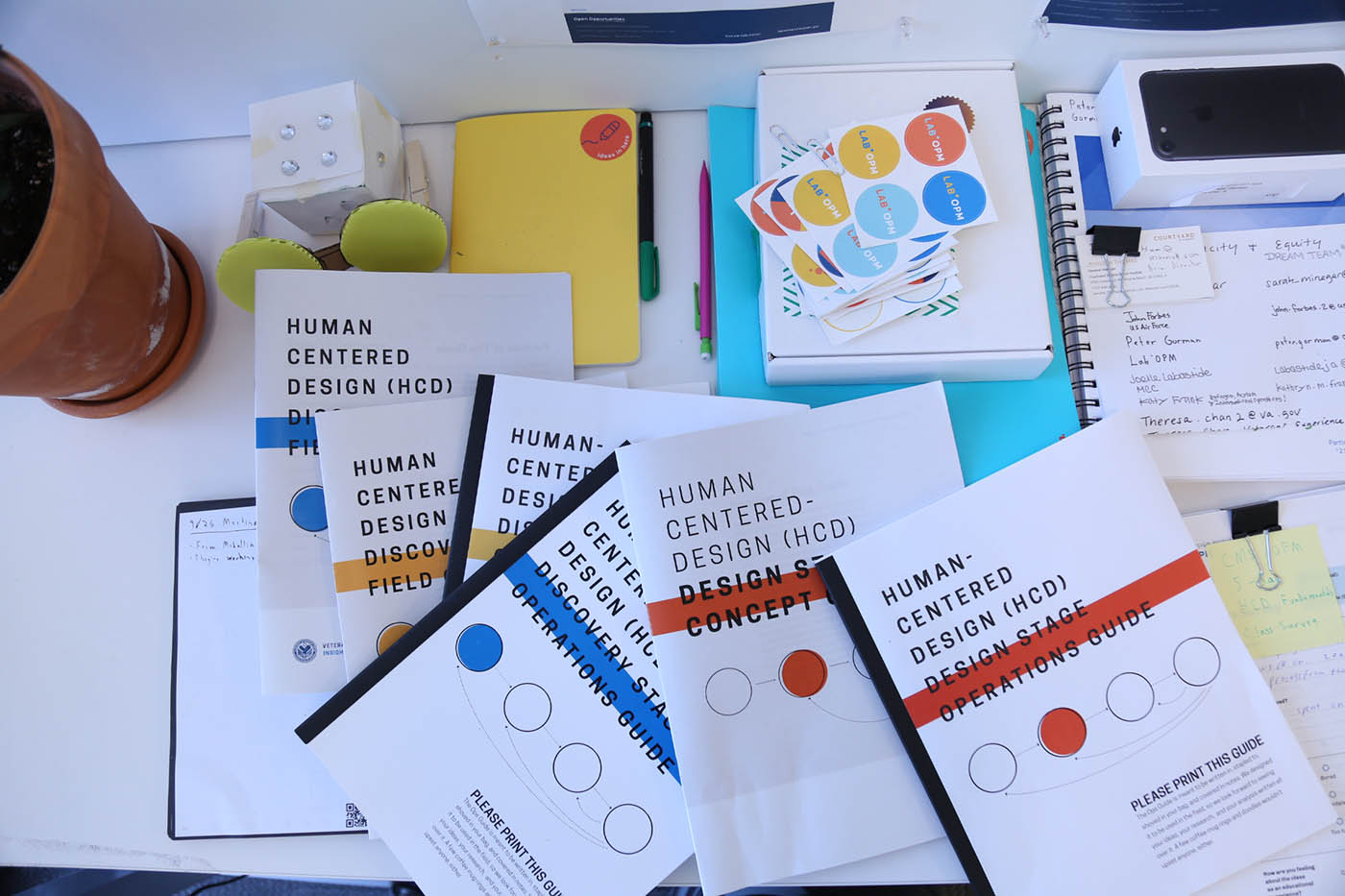
Print versions of all four HCD Guides available from the Lab at OPM. Download them all on the Lab's Github page.
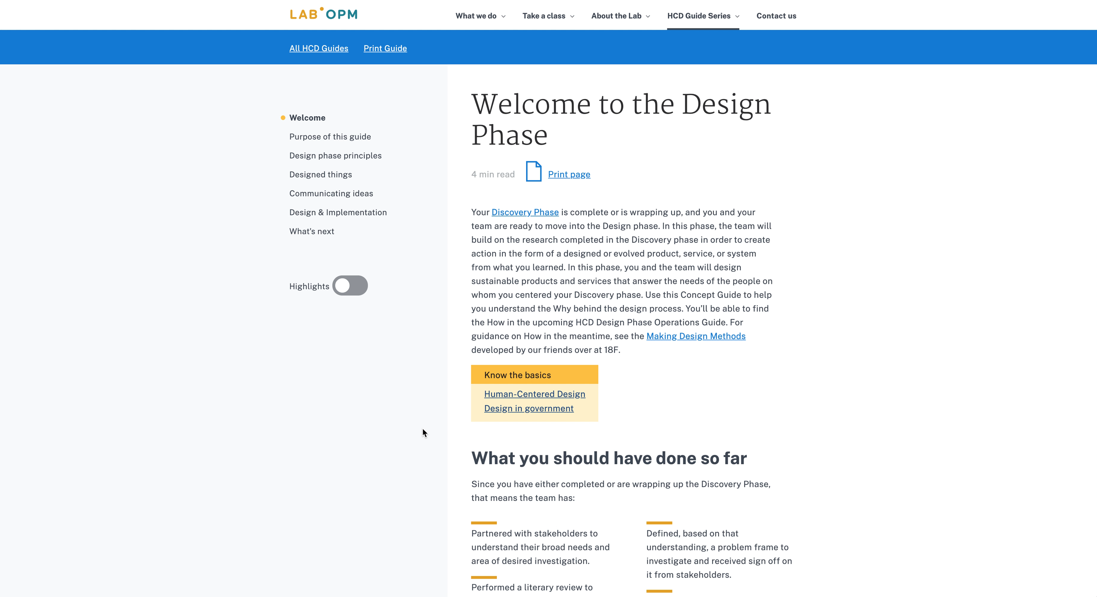
Screen shot of the digital-first version of the HCD Design Phase Concept Guide. This version is currently going through clearance with OPM. See the beta version via this link to the HCD Design Phase Concept Guide (beta). The digital version of the Design Phase Operations Guide (beta), is also available via this link.

Outline of the entire HCD Guide Series project: 2 textbooks per HCD phase, 4 phases, 8 texts in total.
Project Duration: In stages, 3 years. Status: Ongoing
Project Type: Federal
Agency Partner: Department of Veterans Affairs (VA), General Services Administration (GSA)
Role: Lead
Stakeholders: Veterans Experience Office, GSA's Customer Experience Office, the Lab at OPM
Design Phases: Research, Design, Implementation, Measurement (nascent as of 2019)
Skills: Design Management & Strategy, Research, Writing, Illustration, UX, Frontend Development
Product Design Output:
- Here is a link to the print versions of the first four Guides.
- Here is a link to the Design Phase Concept Guide (beta).
- Design Phase Operations Guide (beta).
Implementation: Distribution to over 2,000 alums of Lab classes; reference and applied use in VA, OPM, and CDC projects; continuing VA investment and development in subsequent Guides in the series
Background
In the early weeks of my work with the Lab at OPM, I was approached by our soon-to-be-Veterans Experience Office (VEO)-Chief of Design, Sarah Brooks, to write design process guidance based on a four phase process concept model (above) for our non-design colleagues.
Research
Initially, I was inclined to not think new guidance was required or desirable. There are a ton of design process blogs, vlogs, programs, intros, books, etc, etc in the world 1 and I felt almost certain one of those would serve VEO well. So, I did a bunch of research, combing through every design guide I could find, most scrupulously through the ones from IDEO, CFBP, the uk.gov design group, and the General Services Administration's 18F.
At the same time, I worked with Aaron Stienstra, another designer on our team, and two project managers from Deloitte to find out what exactly VEO employees' understanding of HCD was, what they were looking for in guidance, and what they hoped to get out of using a design process. In the end, we interviewed more than 25 of the 90 or so VEO field employees using open-ended, design interviews to understand their needs.
Research Synthesis
Combining this desk and field research, I think all of us were surprised to find that there wasn't really a good fit for what our colleagues needed. We realized that, yes, in fact, we would need to create guidance for broad, open-ended design in the public sector. They all either focused solely on digital products, or they were too brief and lacked actionable detail, or they were 500 page doorstops that no one could really get through. In order to stay focused, we decided on the following principles:
- Audience: Our audience are mid-level management to senior leaders leading generative (not reductive or evaluative) projects and who have some access to support from professional designers.
- Logic: Maintaining consistently scaled logic across the Guide Series is paramount. No glib exhortations to “Practice empathy!”1 in one line and in the next line reminding the reader to bring Sharpies. We would unpack complicated terms like empathy through plain language and engaging graphics. We would also remind them to bring Sharpies, of course, when those parts of the process came up.
- Tone: The Guides' tone is helpful and instructive, with heavy reference to the films by the Eames Studio, the Disney featurette Donald Duck in Mathmagic Land"2 , and Mister Rogers.
- Serialization:The Guides would be structured as a travel series through design. In the same way you can collect Frommer's Guides to Kyoto and Tokyo and Nagasaki to avoid getting a 500 page doorstop of a guide, we will provide two HCD Guides for each phase of the HCD process: a Concept guide, focusing on why the phase works the way it does, and an Operations guide with checklists and frameworks to help with the how of the phase.
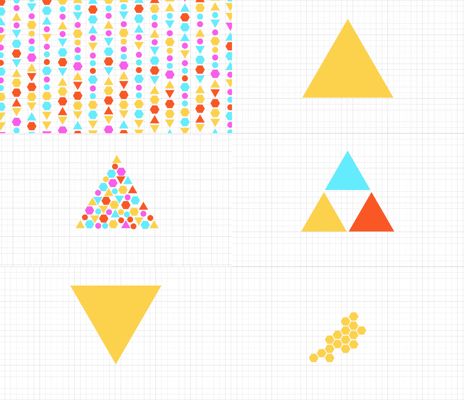
- Visual Communication: We had a saying on the teams that worked on these Guides: if we had time to make these Guides graphic novels, we would. Every place we could possibly show instead of tell, we would do that work. Heavy reference to Scott McLeod's Understanding Comics for this principle.3
- Shoot for the Stars: We were excited to follow in the tradition of beautiful, robust guidance from federal government agencies. It's our dream for the Guide Series to bring design process guidance to shelves containing tomes like NASA's 1976 Graphics Manual and the EPA's Graphic Standards System, . In the digital era, we strive to create UX experiences with the HCD Guide Series like the ones supported by the Consumer Financial Protection Bureau's Design Manual.
For more on the primary research for the Guide Series, specifically for the Discovery Phase Concept and Operations Guides, you can listen to (also watch, but it's mostly listening) this video I made the video below for a 2017 Lab Year in Review for OPM.
Excerpt: “We actually don't need our...colleagues to walk away from their skill sets; we need to give them ways to use those skillsets more effectively...[Our non-design-trained colleagues] need a rigorous, replicable and methodologically sound way to show the depth of their knowledge and the research they can perform when talking to their own customers every day.”
Guide Product Development
As stated above, we are producing a Concept and Operations guide for each phase of a four phase HCD process. The Guides work together, but are modular references. Since our colleagues have a vast array of backgrounds and skill sets, we encourage them to pick the parts they need to review and adapt their skill sets to the process as they can.
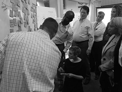
To develop the Guides, we use extant projects to test and iterate their flow, language, and graphics. That way, participants could tell us what was working, what wasn't, and provide meaningful feedback. In a weird, infinite mirror sort of way, this meant we were using the HCD process on real HCD projects to create guidance on HCD process. Good news: the process works! People have been really happy with the Guides, and are constantly asking us when the next ones will be out.
Creation Process
Each Guide strives to be brief, focusing in on the key steps participants need to take to be successful. The works, however, still take a lot of hours of meeting, discussion, writing, and illustration to become real.
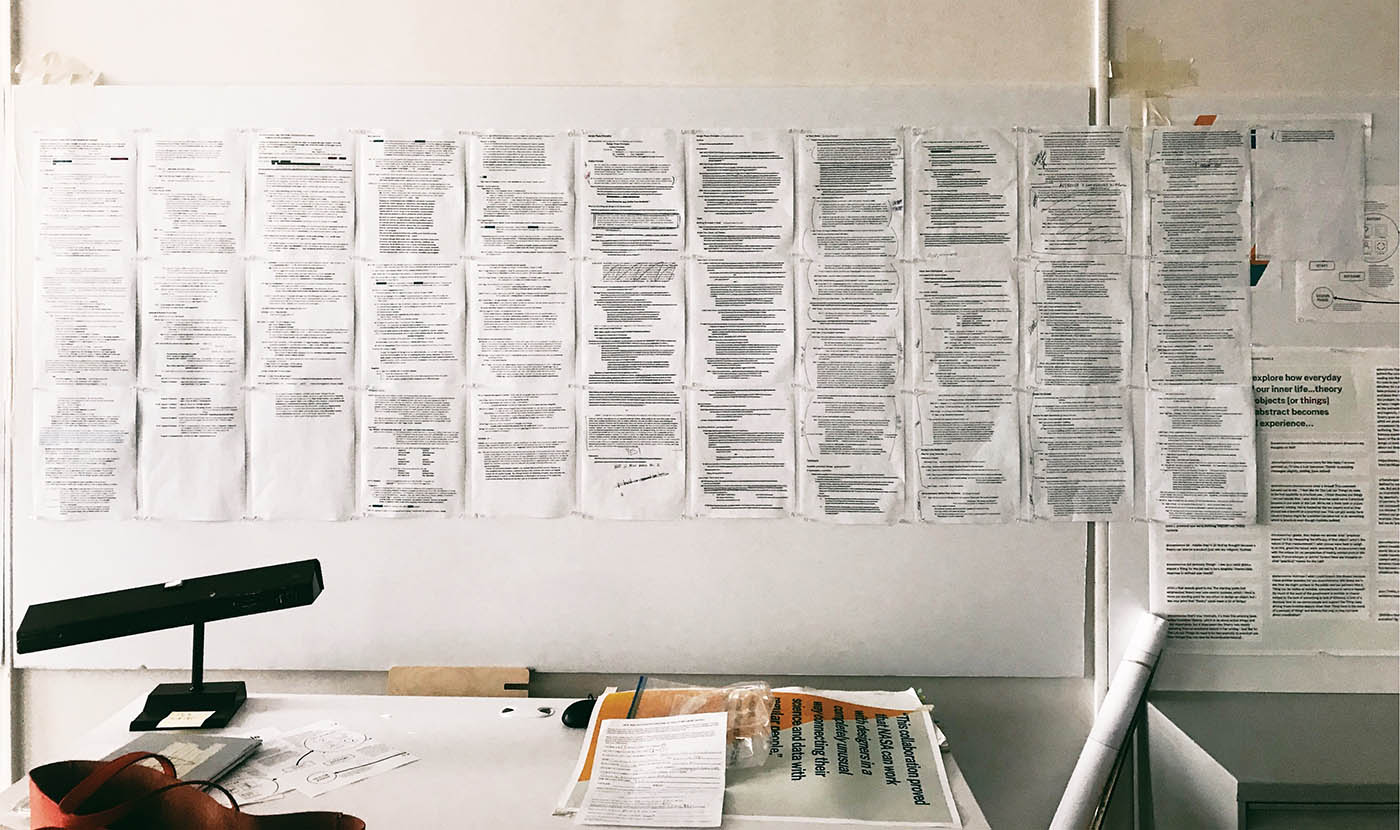
About 70% of the writing edits for the HCD Design Phase Concept Guide (link to beta). I work with a professional, non-designer editor to ensure each Design Guide text is as rigorous, clear and as brief as possible.
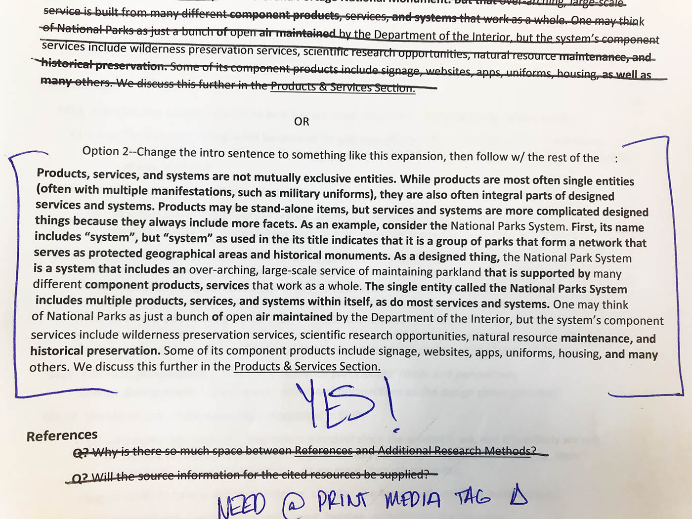
One of the Editor's edits. Moments like this are why I love working in diverse teams; we've all got our speciality, but if we can manage to combine them and put up with each other, the end result is much more brilliant that any one of us would have been alone.

Lolllllll! Excerpt from edits, commentary from my Editor. I consider this a sign that our professional relationship is healthy and honest. It doesn't mean that we never flummox each other or always get along 🤣
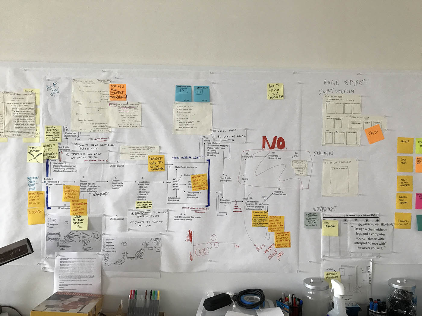
Process wall from version 1 of the HCD Design Phase Operations Guide (link to beta).
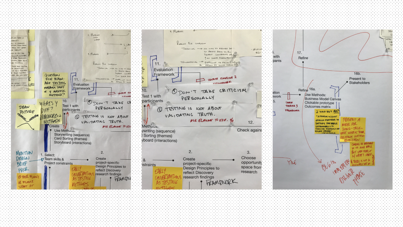
Details from the process wall.
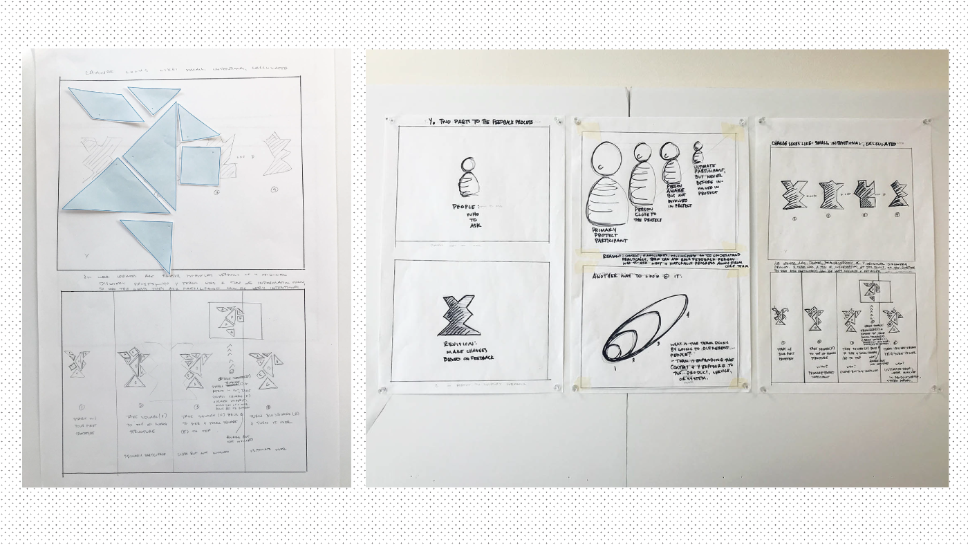
Early drawings from the HCD Design Phase Concept Guide (link to beta).
Guide Series Design
Below, find some spreads from the print versions and screen recordings from the digital ones. For digital, we're hoping the finished layouts will make it to the internet in 2020, but for now, they're getting reviewed by Legal.
Core design elements of the HCD Guides are a focus on large graphics, engaging layouts, and attention to consumable paragraph lengths. This is especially key in the Concept Guides so as to show why the process is the way it is. This graphic approach makes learning faster and sticker, since people can understand the logic of the process and contextualize the work inside their own skill sets.
Discovery Phase Guides
The Discovery Phase Guides step participants through the HCD research phase, aka “Discovery”. In the course of our research, we found that participants wanted print, not digital, Guides, so that they could “throw them in the back of the car” and refer to them as they wished.
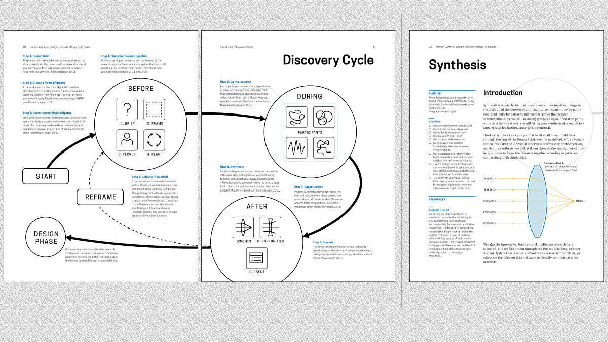
Spreads from the HCD Discovery Phase Concept Guide
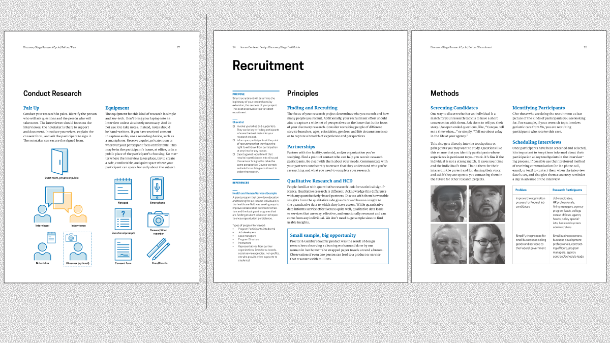
Spreads from the HCD Discovery Phase Concept Guide
Core design elements for the HCD Operations Guides include interactive elements like checklists, frameworks, and thought prompts. The key in these Guides is to create a project bible in which the participants can record their work, allowing them to share quickly and without panic when the time comes to report out to the boss.
Of course, the moment we issued the Discovery Guides as print, everyone asked when the digital versions would come out. Some participants even pulled the pdfs apart, making them slides to refer to on their tablets. For this reason, we designed digital first when starting the Design Phase Guides. Each digital version can be printed in their totality or section-by-section. And of course, to meet all our participants' needs, and because people really seem to love having a physical copy, we also made print-first versions of the Design Guides. You can download the print versions of all four Guides on the Lab's Github.
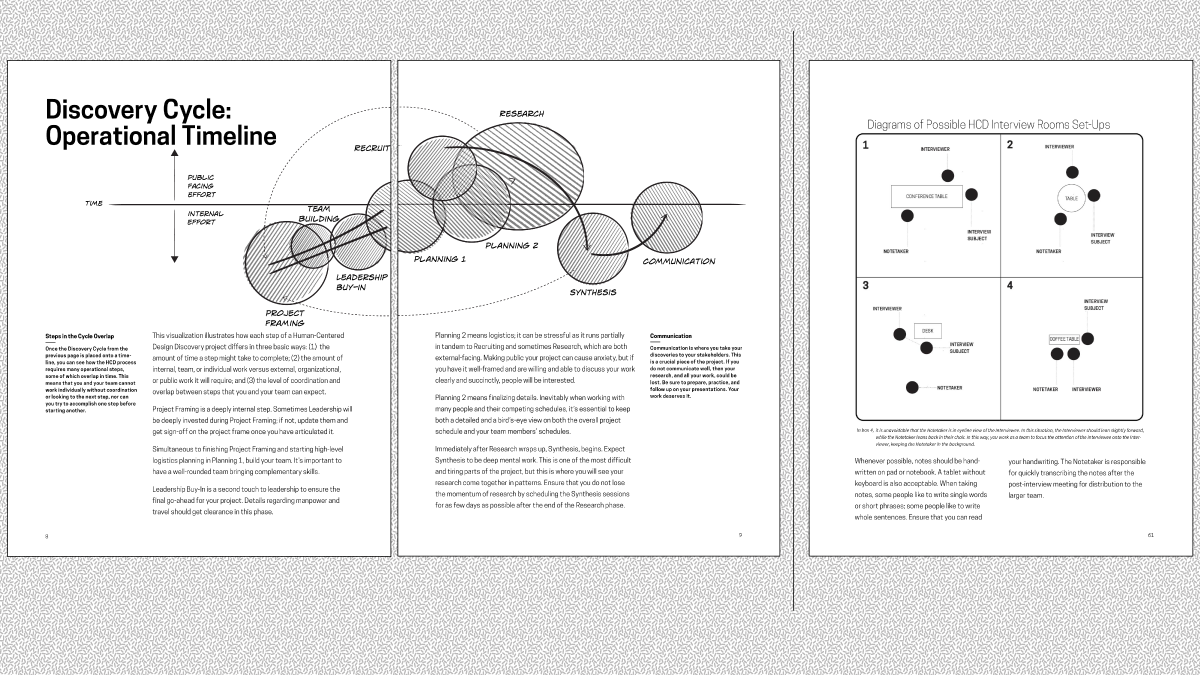
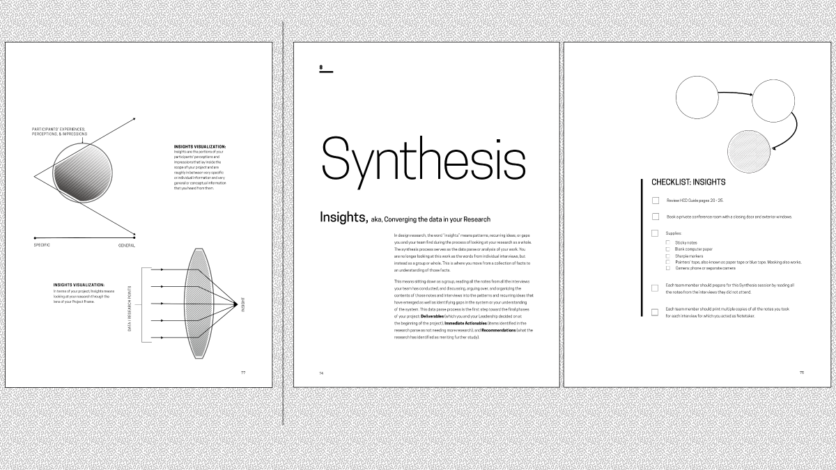
In the Operations Guides, there's an emphasis on large fields of white space. Practically, this gives the participants blank areas in which to make notes; emotionally, this white space encourages calm, ordered thinking as the participants move through this multi-step process.
Design Phase Guides
Moving to Digital First Design
As the Discovery Phase Guides were completed in 2017 and started to circulate, VEO requested the Design Phase Guides' development in late 2018 through 2019. As the principle designer, I thought the Design Phase Guides would be easier to produce than the Discovery Phase; design seems so natural and intuitive to me.
Once I started researching and writing, however, I found that the design phase, so natural to some, suffers from a severe lack of documentation. It seemed like designers simply don't write down what we do.4 I found myself defining design, practically: the creation of products, services, and systems.5 I found myself explaining why principles are crucial elements of design, and I found myself, more than ever, creating a lynchpin text for non-designers to move through this process.
I led the digital design of the Design Phase Concept Guide help of Griddl, a fantastic design agency out of Los Angeles. This UX is based on 18F / the Technology Transformation Services' rad work on the U.S. Web Design System, but extends the System further with the expansion of heading styles, graphically indicated offsets, and large images.
The screen recording above is the final UX for the digital versions of the Guides, deployed on the Design Phase Concept Guide. This is the version that's currently being reviewed in OPM and thusly is not available on the open internet. You can see, read, and interact with the beta versions of the Design Phase Concept Guide via this link and the beta version of the Design Phase Operations Guide via this link.

Some early mocks for the digital Design Concept Guide.

A core value for the team was the use of print media tags to produce intentional, readable print versions of each section and the entire guide. Participants stated over and over that they wanted to "hold the Guide in their hands" and "have it on the shelf". For this reason, we put a lot of care into supporting the digital-to-print transition experience. We provided wide margins for note-taking, reduced the graphics to black and white by default to curb cost, and ensured that the navigation and other website elements would not print. This results in a beautiful, clean, useable print layout, even when you print from the web.
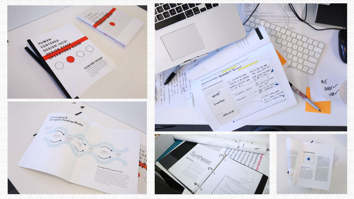
As stated above, we also made print-first versions of all the Guides. In this compilation, you can see both the Design Phase Concept and Operations Guides (the Operations Guide in use!) as well as an earlier, 3-hole binder version of the Discovery Phase Operations Guide. We ended up making a bound booklet of that Guide because of cost; 3 hole binders are expensive! The Lab and government design in general address such large audiences that there's a compelling argument for providing information on both digital and print channels.
Team Growth
The team for these Guides' development also changed and grew as the project continued, which was really exciting. During the Discovery Phase Guides' research and creation, the team fluctuated from between two and four.
During the Design Phase Guides' research and creation, I worked alongside Presidential Management Fellow Sara Romanoski as Project Manager throughout both these Guides. The core team included Sarah Hughes as editor for tone and plain language, Tim Vienckowski for visual design, and two amazing Summer Fellows, Pooja Nair and Bob Zhao.
A growing team meant externalizing the logic of the Guides became more and more important. Below, find the flows we worked through over the course of the 2019 summer. We came a long way from the first, 20 step flow!
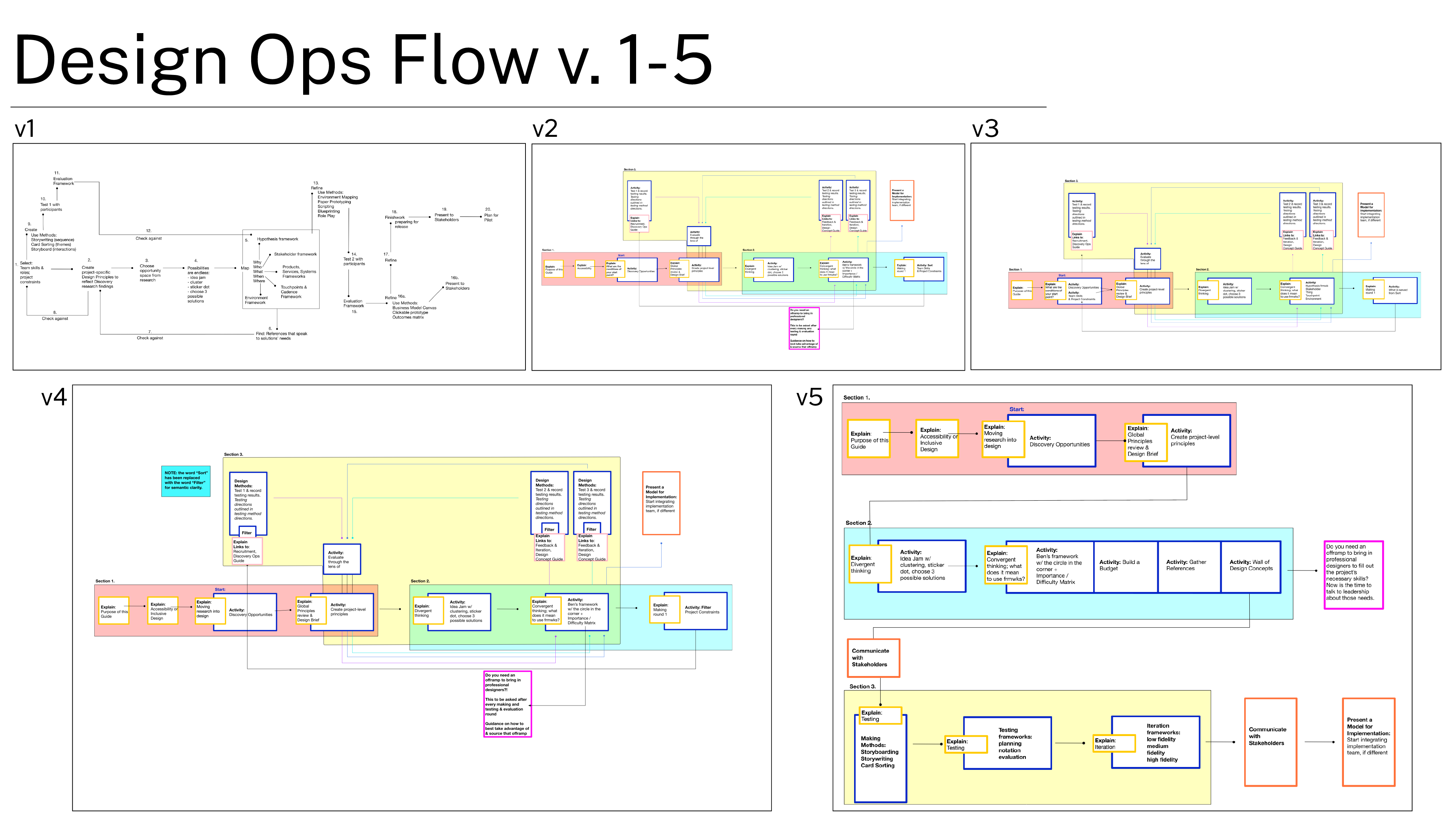
As a team, we invited and edited the contributions of the larger Lab team, especially in the course of the development of the Design Operations Guide. And of course, throughout we coordinated and held critiques with our core participants from the Veterans Experience Office.
Future Guides
Excitingly, the Veterans Experience Office, the Guide Series' main backer, has commissioned the Measurement Guide next. This might make you ask why not the Implementation Guide next? It's next in the process, after all. After research and consultations with Process Improvement specialists, who do a lot of implementation, we concluded that building in intentional measurement points before implementing is a crucial part of the success of an HCD process. So we're currently building partnerships with relevant measurement teams, and we're hoping to get the Measurement phase produced in the next year or so.
Conclusion
As for the current Guides, they're distributed after many of the classes the Lab offers. Currently, we've put them into the hands of over 2,000 of our federal and private sector alums! We also use them as pre-reading for custom workshops, and reference during partnerships. We're also updating them as issues are logged on Github and discussions evolve at the Lab. Sometimes, we take the print versions to conferences, where people seem to really enjoy them. Hopefully, we'll continue this project with partnerships from VA and other agencies; there's a lot of work to be done!
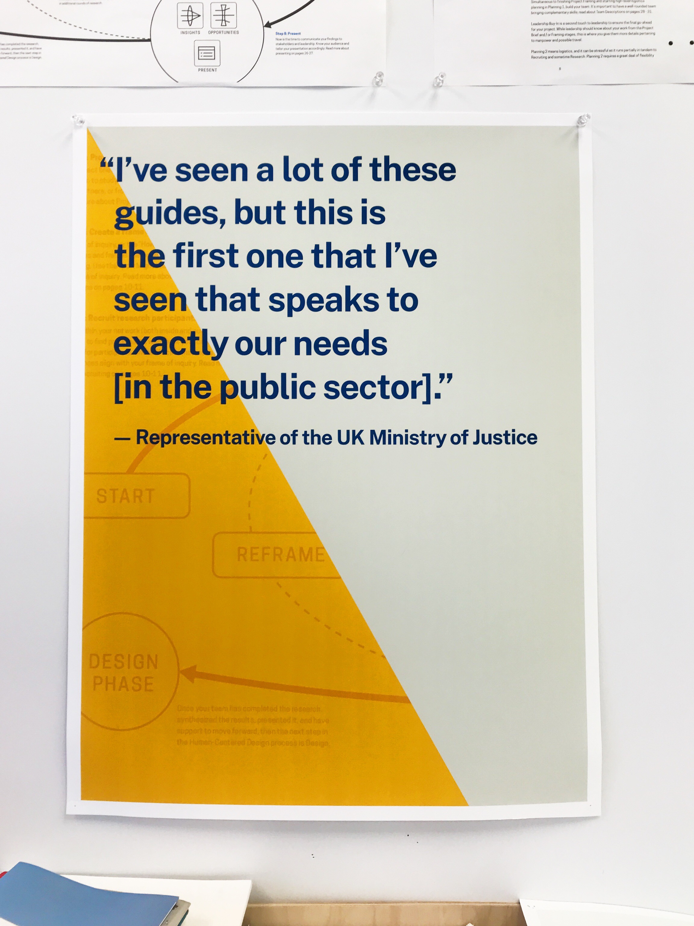
Honestly, this statement at a conference, made to one of my colleagues, might be the high point of my federal career so far.
- For more thoughts on the utility and limitations of empathy, please see the Compassion Over Empathy article.
- Donald Duck in Mathmagic Land was nominated for an Academy Award in 1959 and remains to this day one of my top five favorite movies. I can honestly credit the explanation of Geometry in this film as one of the things that made me want to be a designer.
- If I could have, I would have drawn more graphic identity from Reading Rainbow and Schoolhouse Rock, which I consider paragons of the instructive form. But since the Guides introduce a new thought process to adult professionals and that process is sometimes perceived as squishy / woolly / not serious, I decided that a bit more buttoned up, grid-based, Bauhaus-ian illustrations and diagrams would serve us better at most points. Sometimes, however, we loosened up and got fun, especially in the gifs in the digital editions.
- For more on how designers can and should show process and bring people along, see the Like a Chef article.
- For an overarching look at what designers do, please see the What Do Designers Do? article. For a more granular look at what designers design, please see the Designed Things target="_blank" article.
